NextDoc
Design for Good
Overview
One of the biggest issues of traditional healthcare in the United States is the struggle of booking an appointment with a primary care doctor in a timely manner. When patients are sick, they call for an appointment only to find out the average wait time is 18 days. The next solution is urgent care for a quick prescription, however, according to studies, this does not provide the personalized care that patients prefer.
The goal of this project was to create a native mobile app that provides quality care and services in a timely manner to anyone at low-cost. The target audience are individuals ages 18+ seeking easy, affordable healthcare. We wanted to create a telemedicine app with intuitive design, straightforward doctor matching, and a social feed to show relevant health posts to the user’s interests.
How might we be able to provide fast, affordable, accessible and quality primary care through telemedicine?
Contribution
UX Design Lead
UI Design
User Research
UX Writing
Team
Patria Shallal
Tools
Figma
Adobe Photoshop
Duration
2 months

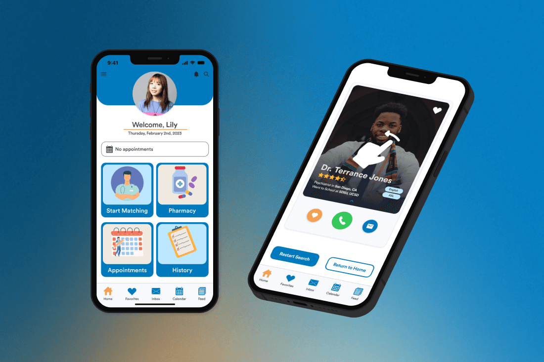
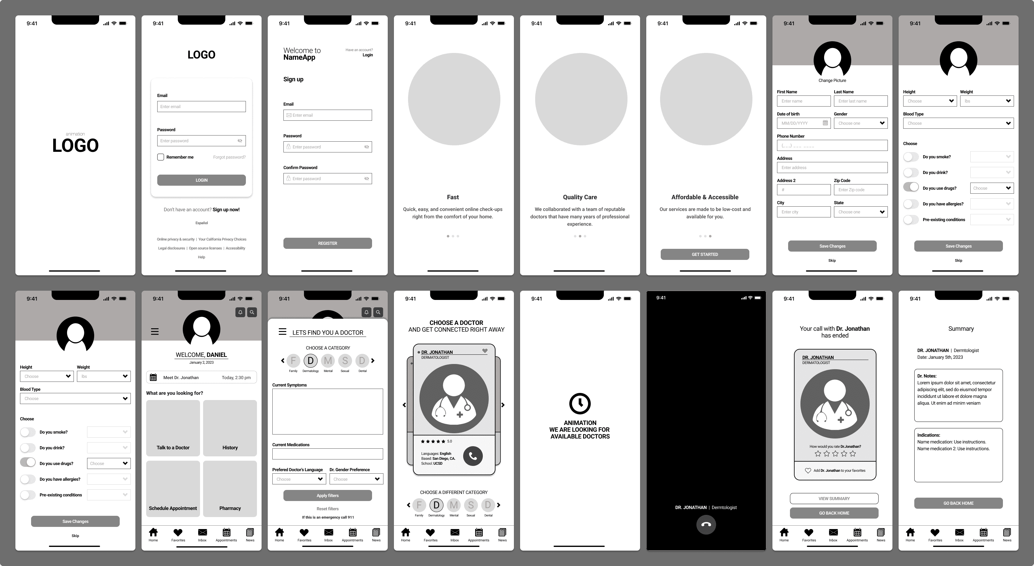
Launch & Onboarding
Users can create their profile and receive customized healthcare solutions by answering a brief set of questions designed to meet their unique needs.
Doctor Matching & Video Chat
NextDoc aimed to simplify the process of finding the perfect healthcare provider, making it an intuitive and user-friendly experience. Through the filter feature, users have the ability to customize their search criteria and seamlessly initiate video consultations with their chosen physician.


Easily access and manage profiles through the slide menu. In the navigation bar, users can conveniently access features such as their list of favorite doctors, messages from the healthcare professionals from previous appointments, a calendar displaying their upcoming appointments, and a captivating social feed brimming with intriguing medical insights, entertaining facts, and more.
Design Process
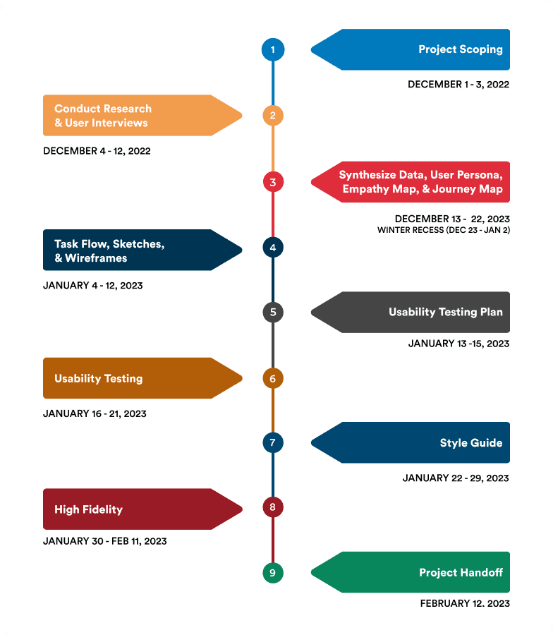
User Research
We sent out a survey to individuals that fit our user criteria and received 37 responses.
We interviewed them with our main goals being:
Conducting qualitative research in order to gain insight into how users engage with telemedicine apps, social apps, and healthcare.
Identify user pain points in relation to their current experience with healthcare, booking appointments, and doctor's visits.
Key Insights on User Preferences:
- Low-cost services
- Quick patient turnaround time
- Doctor that genuinely cares about them
- Convenient and easy to use

Ideation
Users experience the onboarding process and profile building, selecting filters/preferences, and successfully matching and meeting with a doctor through video chat. We used this task flow to create low and mid fidelity wireframes.
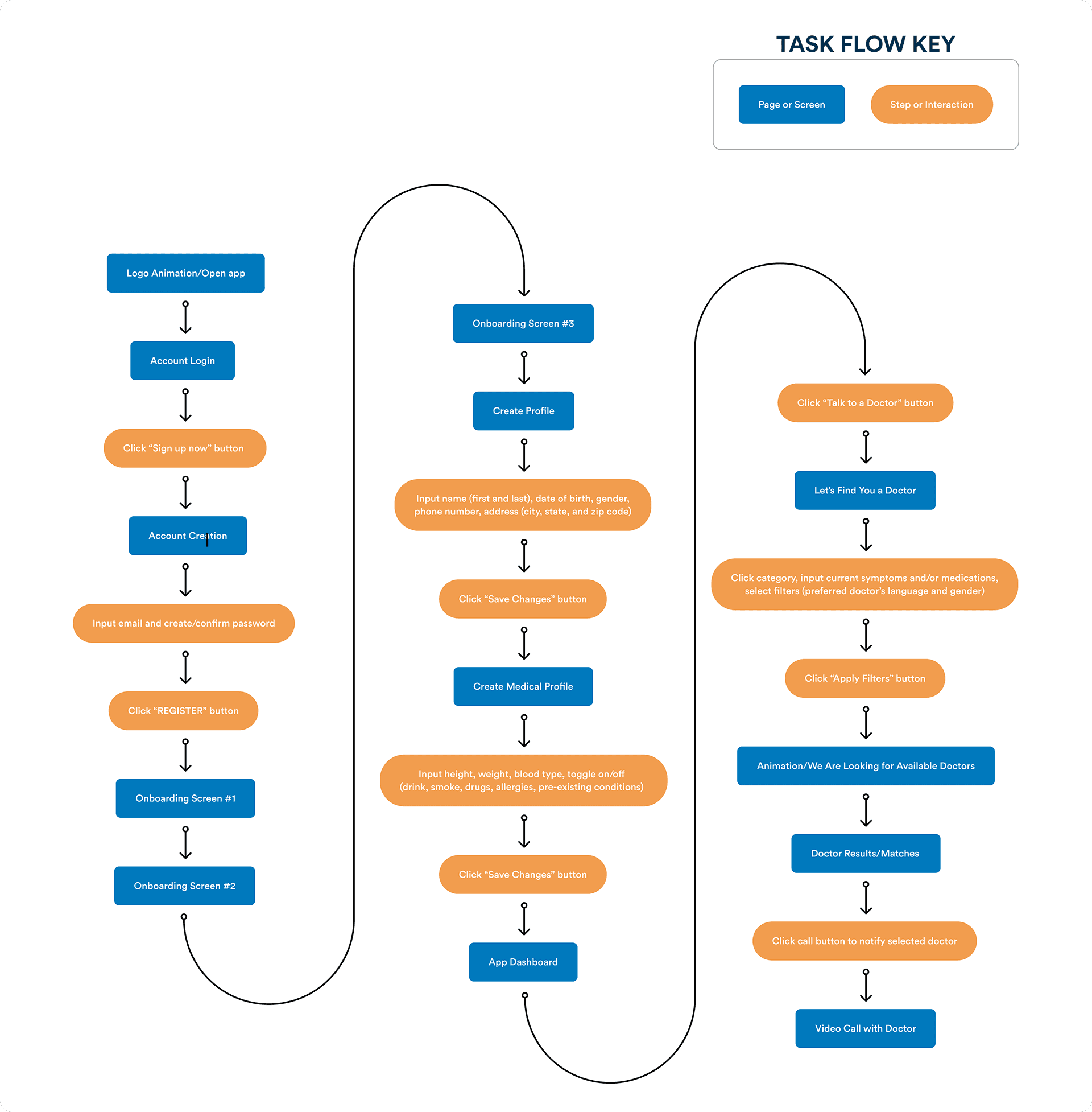
We used our research findings to create mid fidelity wireframes. Soon after, we made it into a basic working prototype to go into usability testing.
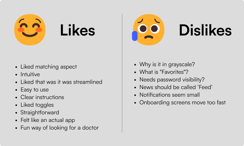
Usability Testing
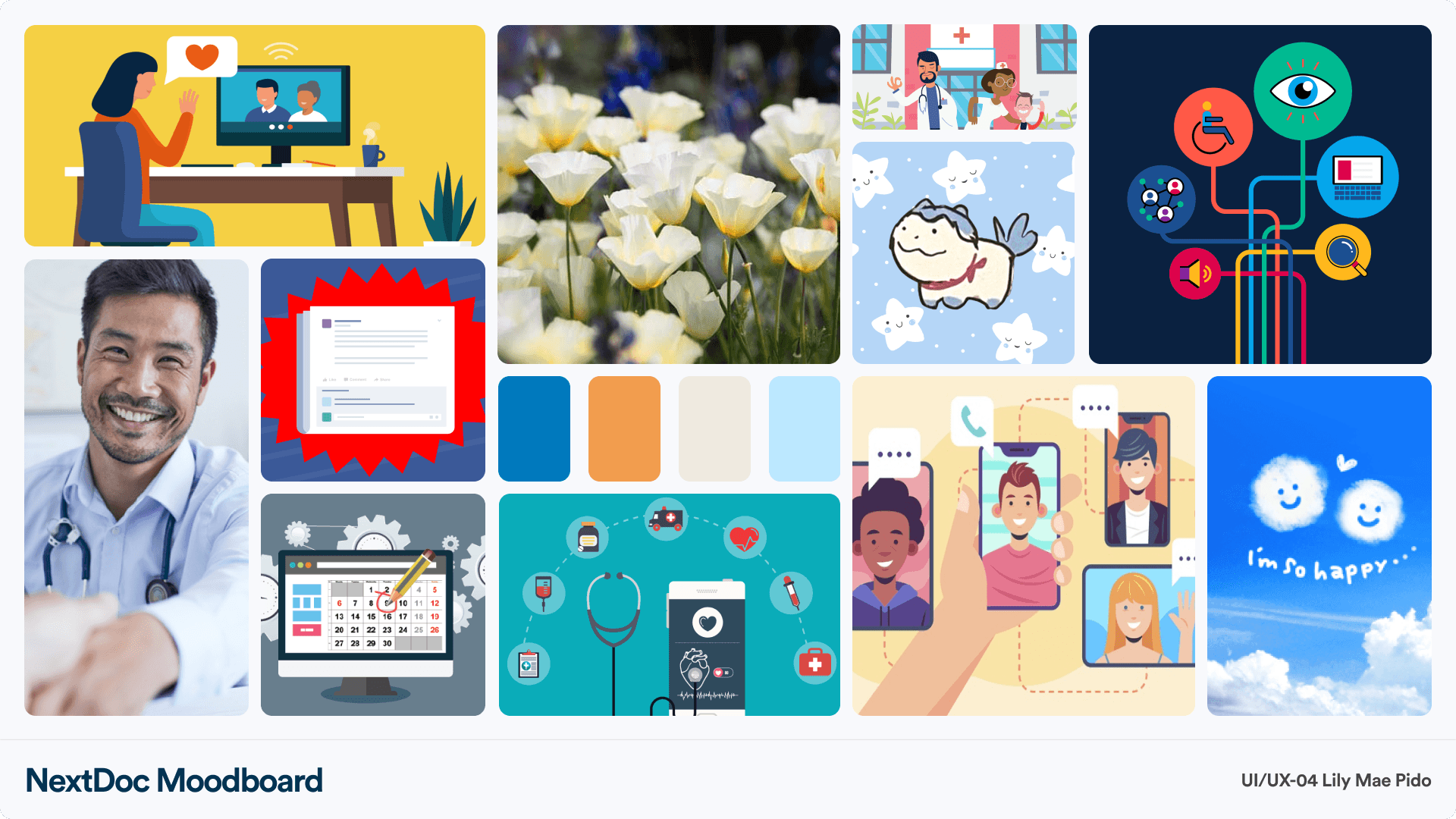
Mood Board
Each teammate was tasked with creating a mood board that would capture the voice and tone of the app. I wanted the app to make users feel something comforting, accessible, a sense of connectedness, and an overall positive experience.
Takeaways
This was my first team project and it was a long end-to-end process. It's always important to make design from the research and data we gathered, rather than our own personal preferences. My next steps would be to polish my prototype, specifically the microinteractions and functions. I would conduct more usability tests, and iterate my prototype based on user feedback and insights.